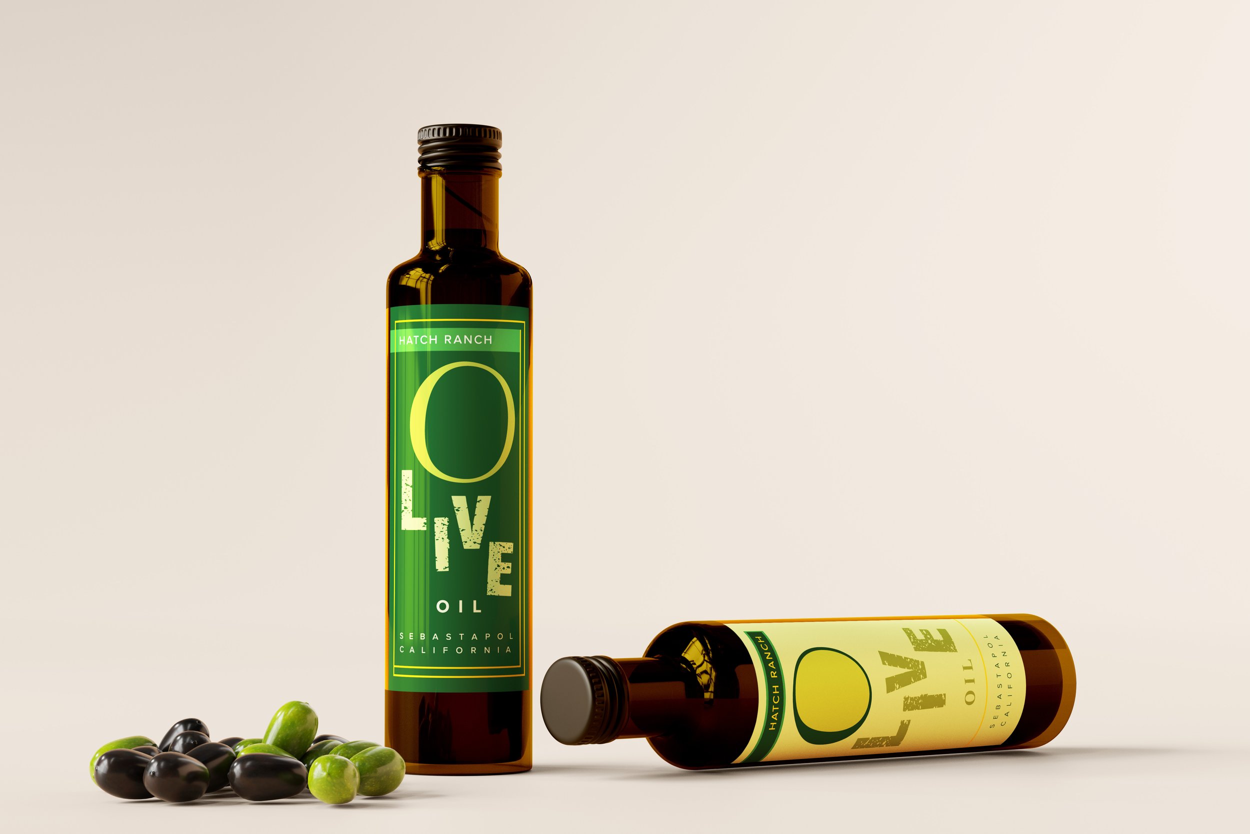
Hatch Ranch is a small business dedicated to producing olive oil. Located in the North of California, the client's target is to create a packaging label that adheres to a homemade and vintage yet modern-looking design.
Hatch Ranch Olive Oil uses a color palette focused on the olive tree. Using the monochromatic tones of green as its main choice of color, it resonates with nature and evokes an organic flavor to the oil. The only exception is yellow which is used to represent the golden nature of California and the golden hours that the farm receives.
Moving away from what is considered as "standard". When going to the grocery store, the packaging for olive oils tends to resemble the packaging from the late 1900s. Trying to bring the label design used in a metal can and adapt it to a glass bottle. However, the translucent or opaque bottle in combination with the label becomes saturated for the eye, thus blending it with other olive oils.
The solution proposed for Hatch Ranch is to use a rectangular bottle that avoids being wide and rounded on the corners. The packaging features a long body with a long neck that facilitates pouring. One single label is created as the product will not be commercially produced.
The project is not complete yet but physical mockups has been processed. Approval from client is needed.


